
I am always happy when I see new modules that try to make it easier for people to have responsive Drupal sites using only the UI. So today I am going to talk a bit about a new module called Responsive Navigation. What it does is incorporates the Responsive Nav javascript plugin as a solution for menus on smaller screens. So let’s see how it works.
To get going, install the module like usual (and the dependent Libraries module). Then you’ll have to create a new folder in sites/all/libraries called: responsive_navigation to store the plugin. And yes you’ll have to put the plugin there. But no worries, it’s fast and if you use drush, even faster:
drush dl responsive_navigation libraries
drush en responsive_navigation libraries
drush rnjs-plugin
And that’s it. This should download and enable both modules and the Responsive Navigation js plugin. But just to make sure that the plugin is loaded by the module, you can check on the Status report page if everything is in order.
Using this module is quite simple once you understand a bit what to expect. First thing you should do is create yourself a menu, but do not assign it to any regions. Next, visit admin/config/user-interface/responsive_navigation and make sure you have 1 selected there. Finally, visit admin/structure/block and you’ll see a new block created by the module. Assign it to a region and configure it.
First thing is to select the menu parent and optionally the menu depth. The parent is the menu you want the responsive-nav.js plugin applied to. After that, the following configuration options are plugin specific.
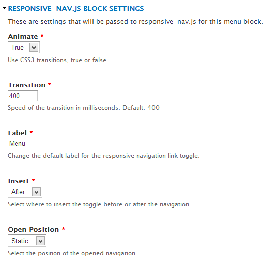
You can select whether you want the menu to be animated or not, and if so, you can specify the animation transition time. You can also write the label you want applied when the menu gets 'closed in'. And another cool feature is that you can choose where the animation should happen once the menu is 'closed in': below or above it.
So these are some pretty nifty things right here. Something to keep in mind though: the module is brand new so there may be glitches here and there. But that’s OK. There is an issue queue where we can all contribute to flagging and fixing problems.
Hope this helps.
Daniel Sipos
Danny founded WEBOMELETTE in 2012 as a passion project, mostly writing about Drupal problems he faced day to day, as well as about new technologies and things that he thought other developers would find useful. Now he now manages a team of developers and designers, delivering quality products that make businesses successful.
Comments
Does this work with menu_block
Can this work with menu_block .... ? So i can assign a responsive_nav that is a menu block using media queries to target specific mobile-width devices ....
In reply to Does this work with menu_block by tenken (not verified)
Hey there. This I don't know
Hey there. This I don't know yet but you can try and let me know how it works for you. One thing about it is that it only accommodates one menu, not several. I am not exactly sure how menu_block uses the menu.
Great module
Thanks for the tip off and walkthrough - a module that will get used plenty in the future by me and many others !
responsive navigation demo
Is there a demo to see how it works?
Thanks!
Add new comment